Monday, April 26, 2010

Forgotten Signs


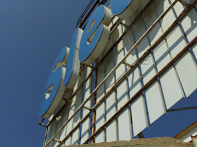
I found these signs at the top of a building near the port. I was taking photos with Nour for our stop motion video, which we didn't end up using. We were trying to get to the highest possible location to take pictures from, and we were going to ask the people on the top floor if we could photograph from their window. No one was there, so we climbed onto the roof. It was full of these abandoned signs that obviously hadn't been used in a while. Beirut is full of left behind pieces. The city has so many layers. There are beautiful things hiding in the most unexpected places.


Wednesday, April 14, 2010

Stop Motion-Nour and Malía


This is the first version of one of our video projects. It is made up of a series of photos from three different locations, the airport, the highway that runs along the boardwalk parallel to the ocean, and Place de L'etoile, in the center of Downtown on the evening of Easter Sunday.

The audio and some of the sequencing still needs adjusting.

I really like the way that the long exposure on the photographs makes the people look very ghostly, and makes all the locations feel otherworldly. There is a general feeling in Beirut of being between things, with a combination of old and new, chaos and order.

As a video made for a small screen, not all of the sections are succesful. This image has very low contrast and the image is very busy.
I think that this image is much easier to see on a small screen, and the moving image is basically light on a very dark background.

Wednesday, March 24, 2010

Flip Book

This project was a way to practice making images which would be clear and interesting even at a very small size. Each photograph printed at 7.5 x 5 cm. There are a lot of types of images which do not work at such a small size, for example, very busy or complex images with a lot of different textures, pictures with very low contrast or which have only a subtle difference in color between the foreground and the background. The images that worked best were very graphic, with clean lines or a clear differentiation between colors and shapes. Anything which is very small has to be against a plain background, and close ups have to be very clear, otherwise they look too abstract and it is hard to tell what the images are of. Because mobile media can be viewed anywhere, sometimes with less than optimal lighting, clarity has to be a main focus. Basically, if you squint your eyes and look at the image and can still tell what it is, then it works for a mobile media format.